Wireframes
I redesigned the app structure to make it more active. I tried to motivate the user to volunteer.

01
On the home screen, the user can
see the Optional volunteering base on his location and receive additional volunteer suggestions.
see the Optional volunteering base on his location and receive additional volunteer suggestions.

02
In the opportunities for you screen, the user can choose to volunteer by distance and change his location as needed

03
When a user clicks on an application, a window opens with short information about volunteering. Then, if the user chooses to volunteer, he has to slide on the confirmation button.

04
After the volunteer received only minimal details and decided to proceed, he came to a contact screen where he could make a call to the elder.
05
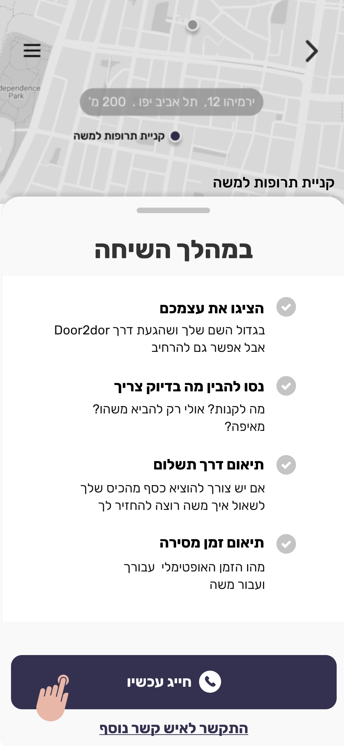
This screen presents the user with information he needs to ask the elder

06
After the call, the volunteer can decide whether it is appropriate for him to volunteer or not. If not, the request for assistance will immediately return to the system that will start
finding a new match.
finding a new match.

07
Once the volunteer has approved the volunteering, he will reach the volunteering screen. First, a window will appear that he will have to mark the time he coordinated with the elder

08
The volunteer can look at the volunteer's information, navigate to the location he needs to reach, and contact the elder and the hotline.Once he finishes volunteering, he can click finish volunteering.

09
At the end of the volunteering, the user can share the volunteering on social networks.

10
If the volunteer requests to cancel the volunteering during the process, we will ask him for information on why he canceled the volunteer.

11
The user chooses to volunteer, which is not immediate, he goes out of the app, so the flow stops. When he returns to the app, a floating button will wait for him to lead him to the volunteer screen.